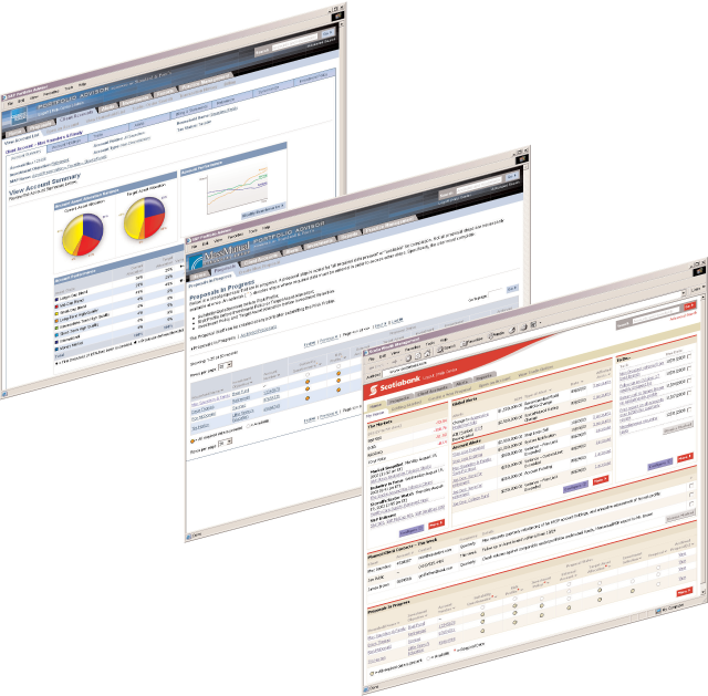
In 2003, i worked on an interesting project with a small but outstanding team. We were flown in to assist with the front-end development on a financial services application that was being developed for Standard & Poor’s in Capgemini’s development centre in Lower Manhattan.
I worked as lead designer on a tactical team with information architects and coders, to deliver the user experience for a complex and powerful hosted investment management application which S&P was planning to white-label and sell to their customers – financial services operations whose investment activities were not their primary line of business – to use for managing client assets and linking S&P research with a wide range of investment products and services.

Not only did the architecture need to be robust and scaleable, the user interface had to be modular and “skinnable” so the look and feel of the application could be tailored to each customer’s brand standards. When demonstrating the application, we were able to do live “switching” of the UI using CSS and JavaScript, which was innovative in 2003.
This capability exceeded the client’s expectations, and demonstrated that we truly understood their business challenges and could deliver capabilities that gave them additional features they could use to sell the platform to their customers.
