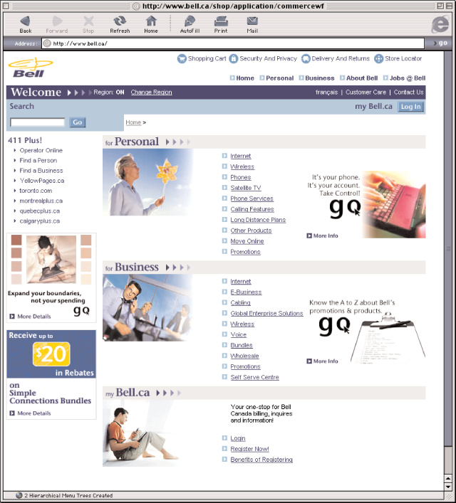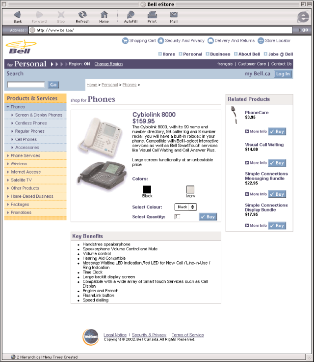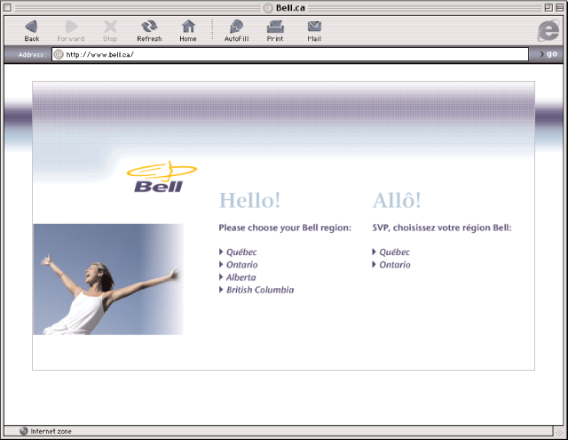
In 2001, our team at Capgemini (formerly Cap Gemini Ernst & Young) worked with Bell Canada on a multi-vendor project to completely re-vamp the Bell.ca eStore. At that time, most of Bell’s site was brochure-ware: Lots of information up front, but transactional functionality – buying and activating cell phones, home phone service, satellite TV, etc. – was buried several layers deep.
Our task was essentially to invert that structure, so the transactional elements were front-and-centre, supported by static content.

The design and production process was a collaborative one, with a team of designers, information architects, project managers and developers from our team, from Bell and from the other vendors on the project all working together. While the project was not without its issues (what project isn’t?), the site was launched successfully and immediately started showing results.

One of our most successful user experience improvements was streamlining the process for purchasing and activating a wireless device from fifteen screens to only seven, which was a massive process improvement, unheard of at that time.
![]()