

I’ve been interested in design for small screens since before smartphones were even a thing. The resolution and user input constraints have always presented unique challenges from a design and user experience perspective.
Of course, as screen resolutions, graphic processing power, touch screens, alternate pointing devices and full QWERTY keyboards have become increasingly common, many of those requirements and limitations have been eased (or eliminated altogether) but new input methodologies have also meant new challenges and new UX paradigms that need to evolve to address the ever-changing state of human-computer interaction.
When RIM moved more into the consumer space with the introduction of the BlackBerry Pearl in 1995, i took interest. But it wasn’t for a couple of years that i started delving into theme design for BlackBerry handhelds for my own personal use.
My first run at it was heavily influenced by the iPhone’s user interface, but i opted to not use any Apple intellectual property, unlike other theme designers, who simply cropped icons out of Apple screen shots, and most other elements fell short of the same level of polish.
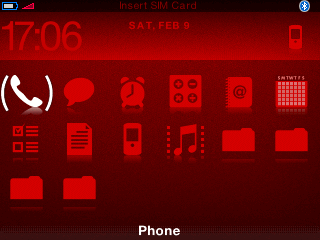
The visual language i began with glassTile prompted me to expand it out into a cleaner, original theme family that ended up with three “metal” variants as well as red and pink themes based off the same iconography. These were made commercially available and they were purchased by several thousand happy users.
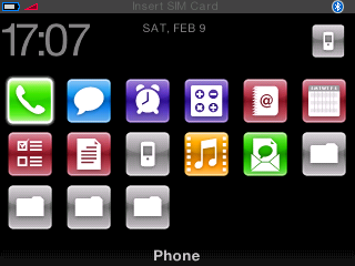
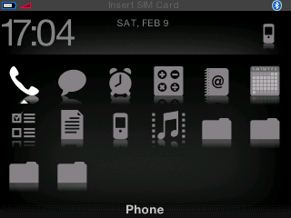
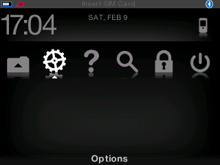
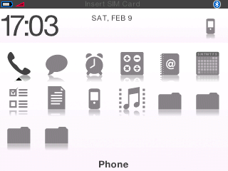
The themes were all based around the same concept of having a “horizon line” splitting the screen into defined areas. There is a clean “status bar” at the top, showing signal and battery strength, carrier info and small icons for secondary functionality such as Bluetooth. The “dashboard” area above the horizon line features a prominently positioned clock in a modern, flush-left position, as well as date information and the profile icon.
These themes were, of course, based primarily on my own preferences for information hierarchy, but it felt completely natural and intuitive. The position of the horizon line was designed to allow consistency of the menu bar and dashboard on subsequent screens for phone lists and in-call displays.