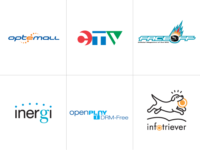
Some of these were branding exercises that launched and then went in a different direction (or that vanished for one reason or another). Others were just creative exercises or playing around with ideas.
Top row: (left to right) Brand identity for an initiative by Cadillac Fairview to expand their IT reach into their retail properties by offering data and networking services to their tenants. // A creative accident turned into an exploration of a possible future visual identity direction for a Canadian television network. // Reactor art-directed the first few issues of a new hockey magazine. This was my contribution for consideration for the masthead.
Bottom row: (left to right) Brand naming and visual identity for an IT outsourcing joint venture between Capgemini and Hydro One. // Creative exercise to come up with a name and identity for consumer media free of digital rights management. // An data synchronization service where information becomes “loyal” to its owner, and changes get automatically pushed out through the network to subscribers. What better represents loyalty than a retriever?