When the owner of a small-but-growing landscape design/build company approached me for a new visual identity, he stated his goals were to differentiate himself from his competition, and to potentially target a slightly more upscale, sophisticated clientele.
He already had the name, business cards, and a simple website, but none of it was working together, and it fell into the all-too-common-for-the-marketplace “green” aesthetic. He wanted something different, that set him apart in his creation of beautiful, livable, and sustainable outdoor spaces.
After doing a competitive audit to see what else was in play, it became clear that for true differentiation in the landscape sector, we had to avoid the conventional thinking and clichés that pretty much defined an entire market.
Rather than focus on the execution – trees, flowers, decks, fences, stone work, etc. – a more conceptual approach was taken that focuses more on the creative process.
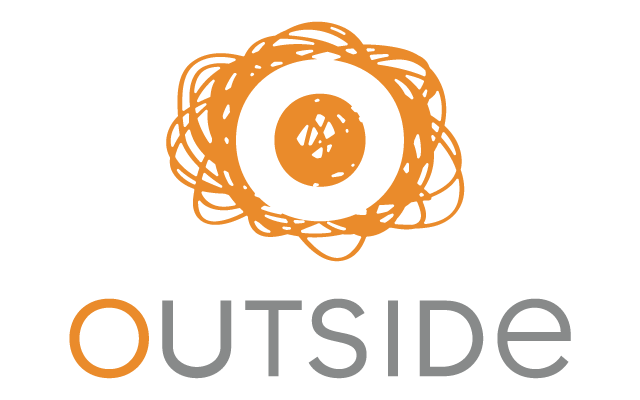
The symbol and colour represent unconventional, uninhibited, “outside” creative thinking. Colouring outside the lines, with the company signature “O” formed in the negative space. The warm and vibrant orange colour was chosen as a direct contrast to the blues and greens so often seen in the landscaping business.
The result is a bold and distinctive identity that supports and communicates the Outside brand: Outside spaces and outside creativity.
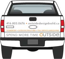
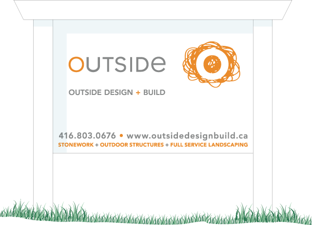
The tagline, “Spend more time Outside” was also developed to draw more attention to the company name and the play on words. Both horizontal and vertical lock-ups of the identity were created to allow flexible placement on vehicles, equipment, uniforms, and lawn signs.
The results were immediate and powerful, with many sightings, recognition, and recall of the company truck in High Park and Bloor West Village within days of the new image hitting the streets.
The client couldn’t be happier, and that’s the best result of all.


