Our client at Mackenzie Investments came to us with a interesting challenge. They were without in-house creative director and had not yet committed to retaining another full-time replacement. We were asked to step into an “acting creative director” role to address their immediate needs, assess strengths and weaknesses within their department, and examine their processes from creative concept through production. One of our senior designers was seconded to the role, leading their team and getting a sense of how things worked from a day-to-day inside perspective over the course of a few months.
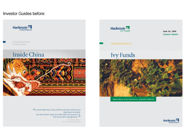
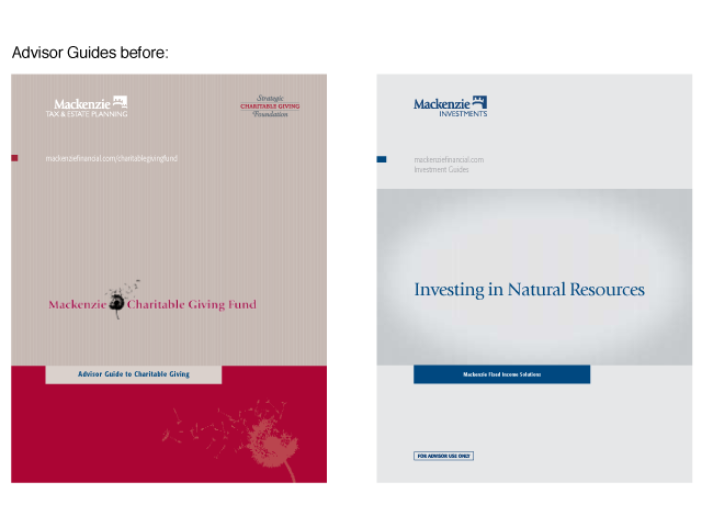
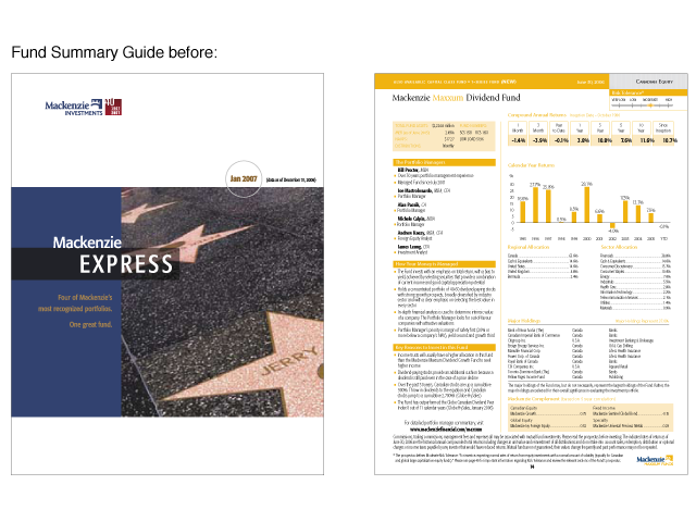
One issue that we identified was that while they had a set grid and typographic treatment for their collateral, they had some issues with consistency. Their brand look had evolved (or devolved) over time, largely as a result of product managers art-directing over the shoulder of the design staff. Since their previous creative platform did not have a well-articulated rationale behind it (or if it originally did, it was lost over time), the creative staff often had no solid ground from which they could defend the integrity of their creative direction and decision-making.
We saw an opportunity to evolve the Mackenzie brand look, and to work with the stakeholders involved to develop a creative platform and rationale for image selection that would allow the creative staff and product managers to all be working together toward a common goal of brand and image consistency. By involving the stakeholders from an early stage, we helped them to collectively take ownership of this new platform in order to ease its introduction and have it take root and grow in a sustainable and consistent way over time.
The creative platform that was proposed and accepted focused on a core theme of “organic growth.” Drawing inspiration from images of growth in the natural world put a diverse catalogue of images at our disposal, with image content and execution tied to each Mackenzie brand, sub-brand, product and service offering.
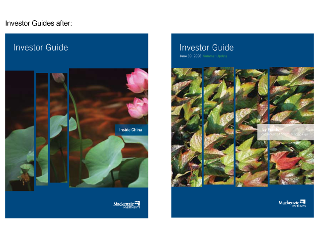
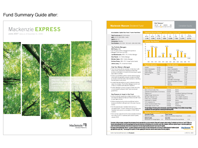
Investor Guides were given the Mackenzie brand blue background. The old “pinstripe” look was retired in favour of a cleaner, more contemporary look that would have fewer reproduction issues. The core imagery was enlarged, and images were treated in a multi-pane approach, with a gentle upward movement of the panes from left to right (reflecting the upward growth of a bar chart).
Images were also chosen to be thematically relevant to the subject matter. For example, the “Inside China” guide depicts lotus flowers on the cover. The use of symbolic images and metaphor was a strict requirement to help guide the creative staff and product managers away from the use of literal images on the covers, as the predictable and cliché stock imagery already in use resulted in the Mackenzie brand appearing less distinctive and visually sophisticated.
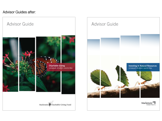
Advisor guides were given white backgrounds, to make them visually distinct from the investor pieces. This differentiation helped advisors quickly identify advisor and investor communications when faced with a large volume of printed materials.
Different fund families were also given “sub-groupings” within the overall theme of organic growth. Mackenzie-branded funds used the forest as its core imagery, and other fund families under the Mackenzie umbrella used more specific imagery. For example, Maxxum funds would use oak trees and acorns, a symbol of strength and endurance; Cundill funds would show images of growth happening in adverse conditions – a tree growing out of a cliffside or crocuses pushing up through the snow – to symbolize “finding value in unlikely places”; Symmetry portfolios would use imagery of crystals growing, and so on.
The quarterly fund summary pieces were given seasonal images on their covers, with a slightly more “editorial” feel under the “Mackenzie EXPRESS” masthead.
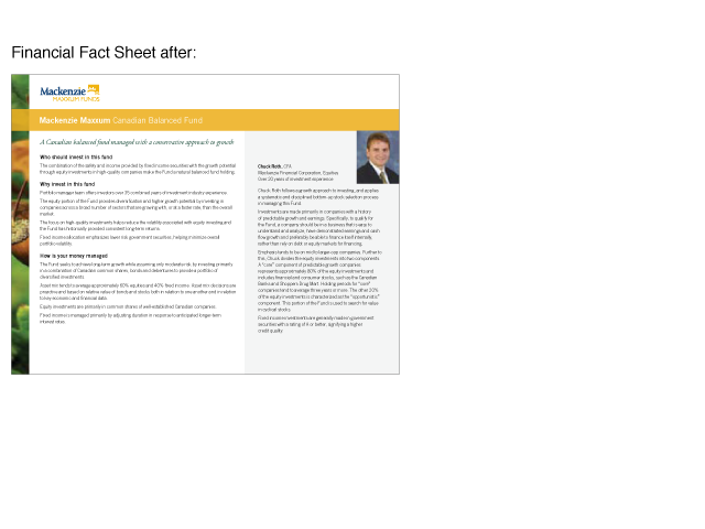
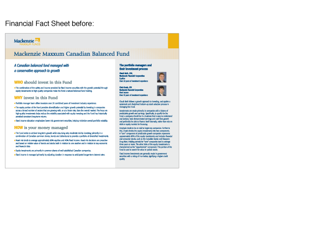
Individual fact sheets were also updated, using a narrow strip of a brand-affiliated image on the left to tie each fund to its parent product grouping.
The new brand platform was a tremendous success. The creative staff felt they had a strong creative platform from which to work, giving them a conceptual framework to work within, while also providing a common language with which to discuss creative choices with product managers. Those same product managers were also brought into the loop on the creative platform, and they quickly became internal champions of the new approach using symbolism and metaphor as a more unique and sophisticated way of expressing their product’s attributes.
