CUMIS has operated in the insurance space for over 75 years, serving the credit union space exclusively, with a commanding market position. The brand values were strong, but the visual identity did not reflect the people-focused approach that CUMIS employees and customers felt so strongly about.
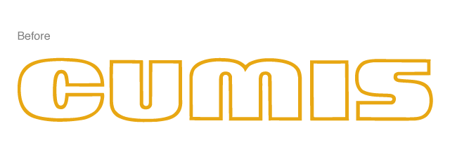
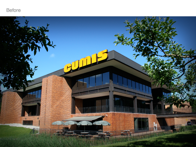
The first goal was to revamp the logo itself. The name itself (believed to have originated as an acronym for Credit Union Members’ Insurance Society) had pronunciation issues, and the look was pure 1970s brutalist-industrial, with heavy, architectural letterforms depicted in dull mustard yellow outline on a white background.
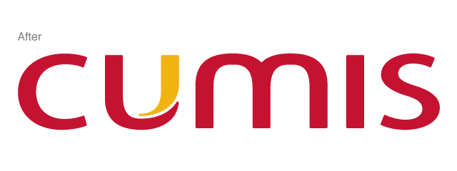
With the new identity, we sought to bring emphasis to the “U” in order to force its pronunciation as a long vowel sound. We also wanted to bring some symbolism to the identity without actually creating a symbol. After exploring several options combining a wordmark and a symbol, a decision was made that the refresh should be more of an evolutionary change, so the mark of identity would continue to be typographic in nature.
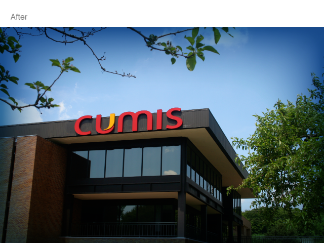
The solution was to treat the “U” as if it were a loop of ribbon, one side red and one side gold. These two halves were then split and allowed to “cradle” one another, in a gesture similar to hands cradling, protecting, nurturing, representing the goals of an organization offering insurance and wealth management products and services.
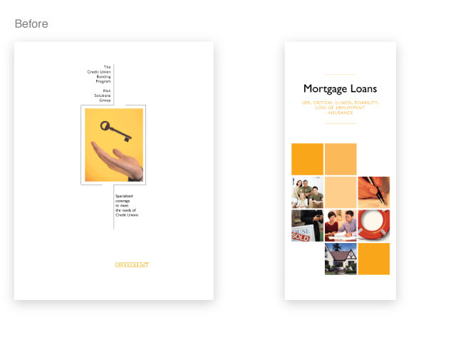
Printed collaterial pieces were another trouble area. When viewed together, all of their brochures and other communications pieces had absolutely no family resemblance at all. They almost looked like they came from completely separate companies.
It wasn’t hard to see that they had a serious brand image problem. This was in part due to: a) the core values that helped to define the brand becoming lost; b) product managers who viewed their departments as “sub-brands” and believing that their needs were different from everyone else’s; and c) an internal creative department lacking inspiration and having grown accustomed to product managers art-directing the creative. Working with the CUMIS Marketing & Communications team, we set out to address each of these issues in an integrated way.
As we set about creating a new visual language for the CUMIS brand, we recognized that key internal thought leaders and stakeholders needed to be brought in early in the process. By presenting and receiving approval on all creative direction from the executive level first, that “top-down” endorsement helped smooth the adoption of the refreshed brand throughout the organization, rather than having to push and fight to sell new concepts into the organization from the bottom up. Rather than creating “brand police” to monitor and control things, we wanted to create an entire organization of brand advocates who wanted to do everything possible to promote a strong and consistent brand.
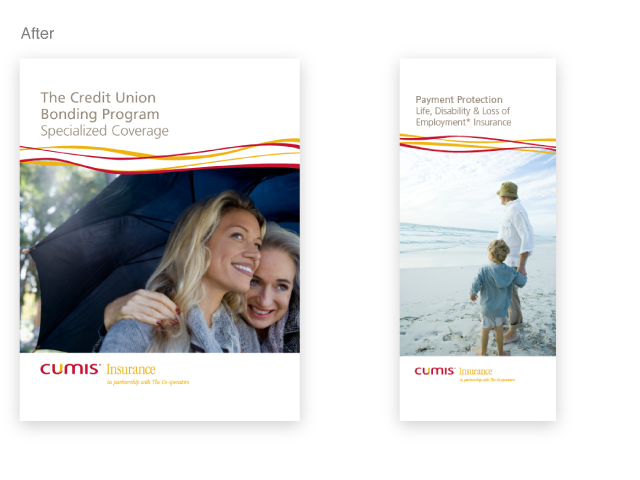
We extended the “ribbon” idea from the identity into a visual motif that separated the masthead area of cover pages from the image and supporting content. These ribbons also extended to the interior of pieces. Generous use of white space also helped the elements stand on their own and not get lost in cluttered layouts.
Photography was to be used exclusively, with images portraying everyday Canadians engaged in activities together. The rationale was that insurance should allow people to go about living their lives in happiness, with the knowledge that should anything unexpected happen, the would be looked after, as would their businesses, property and loved ones. The sense of community reflected in many of the images was also intended to suggest a connection to the core values of the co-operative movement.
We often say that a brand is more than just the logo on the building. But in this case, refreshing the brand also included the logo on the building! The revitalization of the brand was extremely successful, and in 2009, The CUMIS Group was purchased by The Co-operators, who continue to operate the brand and serve the credit union sector.
The revitalization project secured the value of the CUMIS brand as a core asset, which was a factor in the $232 million purchase of CUMIS by Co-Operators and Central 1 in September 2009.
